
Earth echo
Earth Echo is a health supplement brand with a diverse product range, requiring a packaging system that feels both vibrant and cohesive. Using bold colors, clean layouts, and a unified visual approach, we created packaging that communicates energy, wellness, and quality while giving each product its own distinct identity.


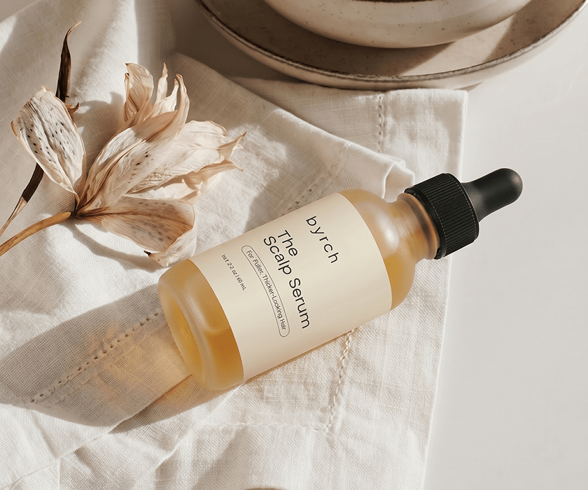
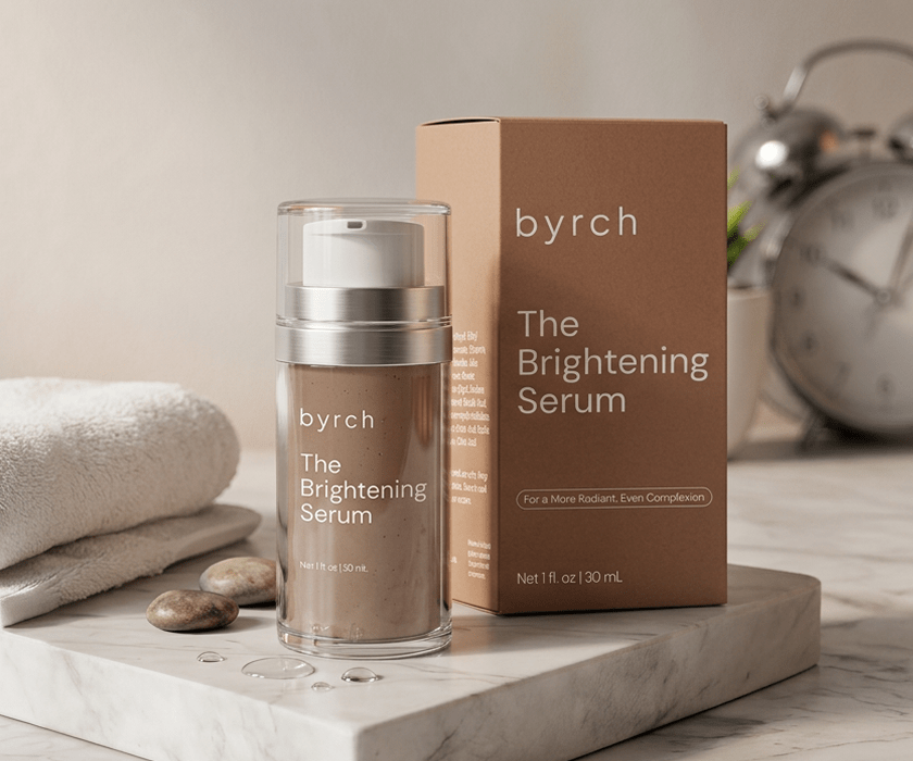
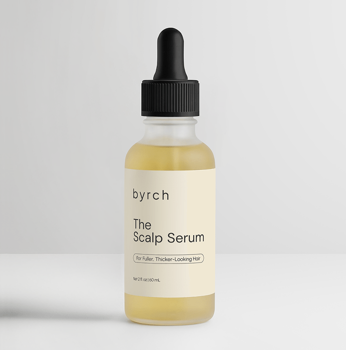
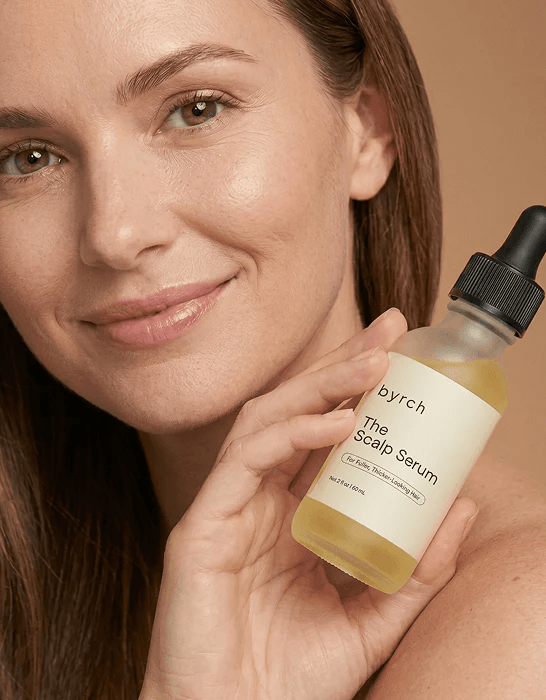
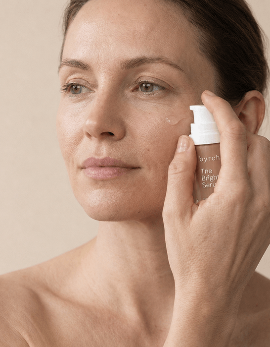
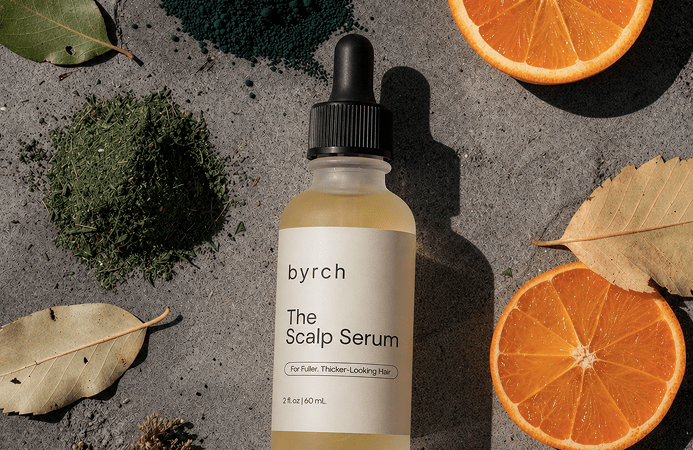
Byrch
For Byrch, we designed minimal, premium packaging that reflects the brand's clean and modern identity. Refined typography, balanced layouts, and elegant details come together to create a sophisticated look that highlights the quality of the products and delivers a timeless customer experience.




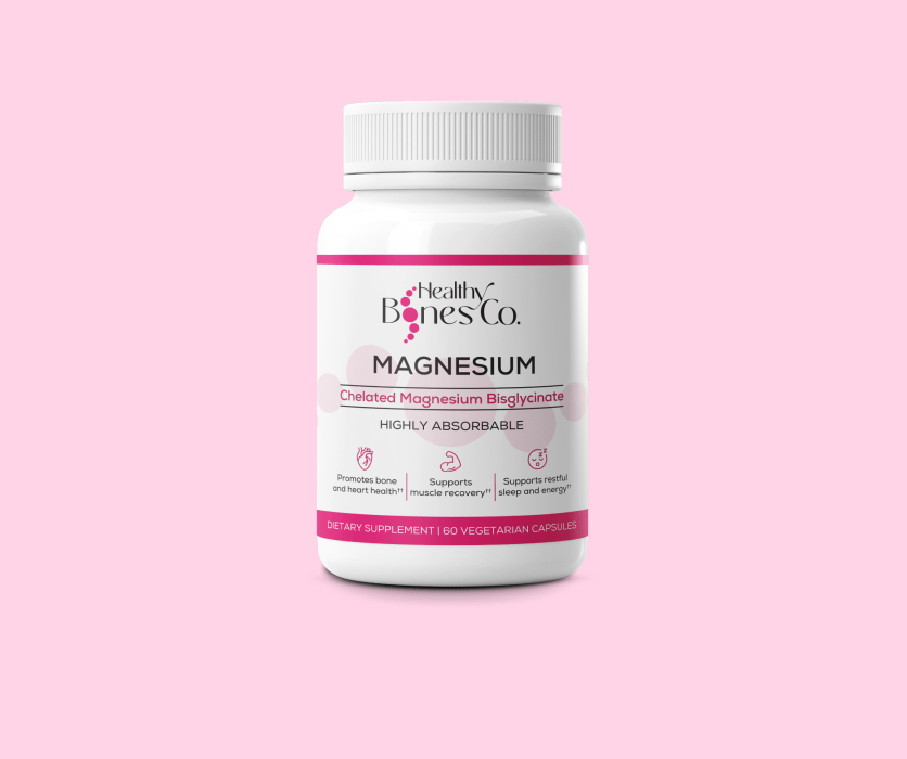
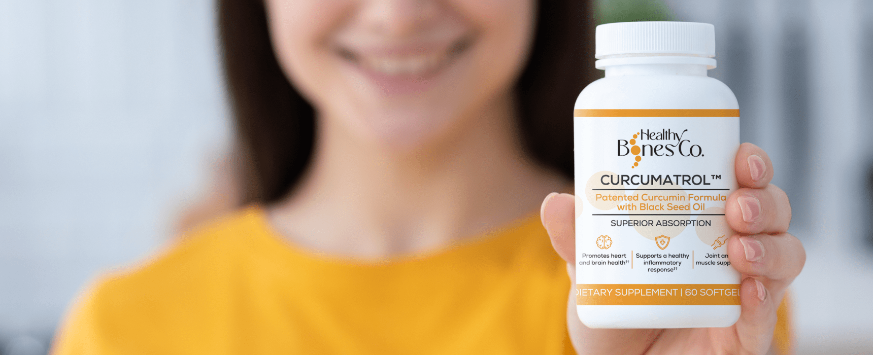
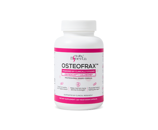
Healthy Bones Co.
For Healthy Bones Co., we designed soft, inviting packaging with subtle pink highlights that reinforce the brand's focus on health and wellbeing. A unified visual identity connects the product range, creating a polished look that feels both trustworthy and modern.





The Midlife Pause
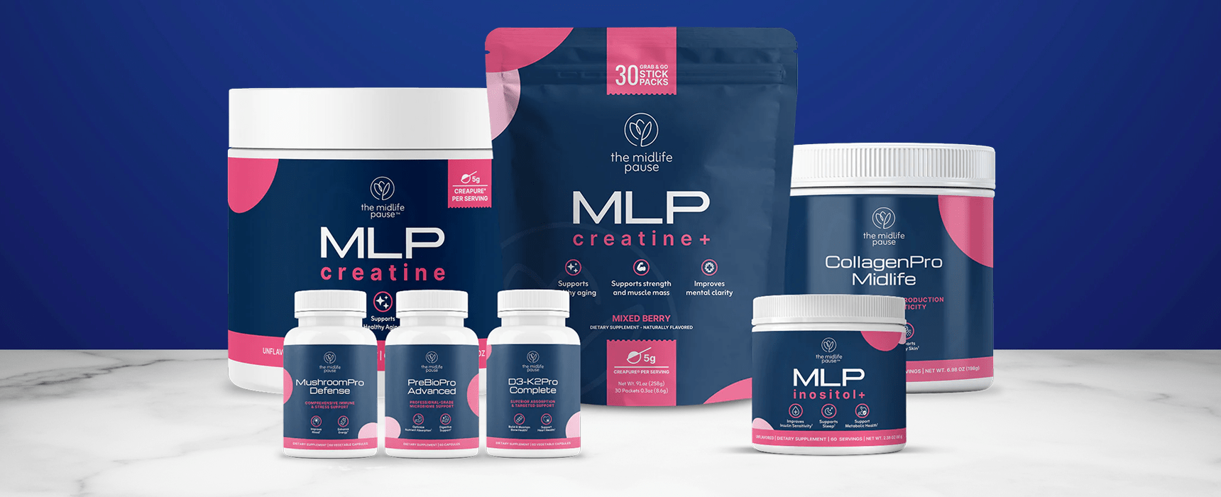
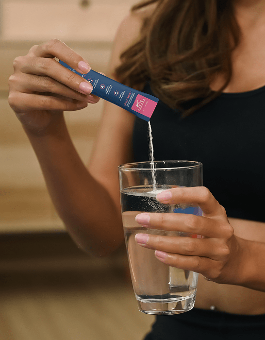
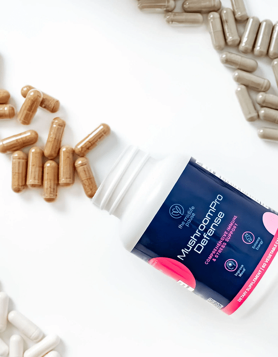
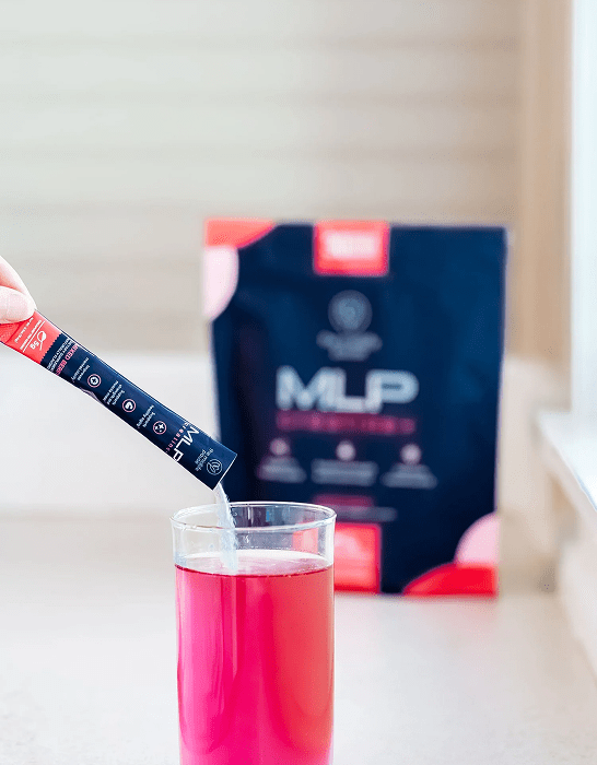
For The Midlife Pause, we created a modern and cohesive packaging system for a growing range of health supplements. Clean compositions, a carefully selected color palette, and engaging visual elements give the brand a distinctive identity while making the products feel approachable, memorable, and consistent across the collection.


Adonis Vitality
For Adonis Vitality, we created bold packaging that reflects strength, confidence, and
masculinity. A striking black color palette with orange highliths, clean typography, and
modern design elements give the product a powerful presence while reinforcing its
premium positioning.



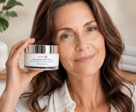
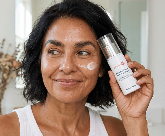
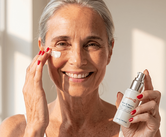
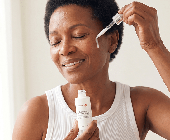
Youthful Me
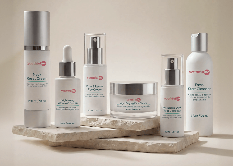
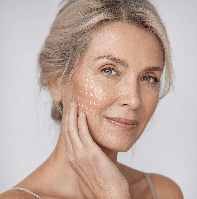
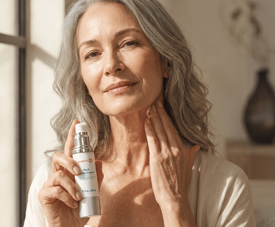
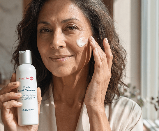
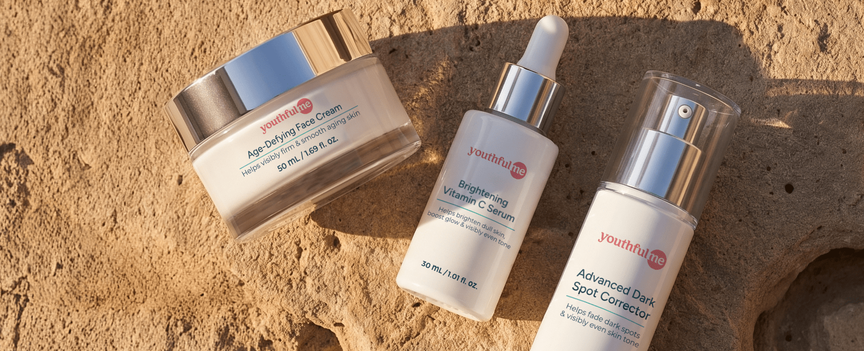
For Youthful Me, we developed sophisticated packaging that embraces simplicity and clarity. The clean design, refined details, and consistent visual language create an elegant product range that reflects the brand's focus on effective skincare for mature women.


Wild belly and new flex
For Wild Belly and New Flex, we created vibrant packaging that brings personality to the world of pet supplements. Playful illustrations, bright colors, and charming details create a fun and memorable identity while keeping the products easy to recognize across the range.



Power greens
For Power Greens, we designed modern packaging centered around a vibrant green palette that instantly evokes healthy superfoods and natural nutrition. The bold yet clean design reflects the product's powerful benefits while creating a fresh, energetic presence that stands out on the shelf.



LEXI
For Lexi, we designed sophisticated packaging for smart home devices and smart lighting products. A modern visual approach, refined details, and thoughtful design elements highlight the technology and features of each product while creating a premium and cohesive brand experience.



Peak biome
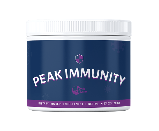
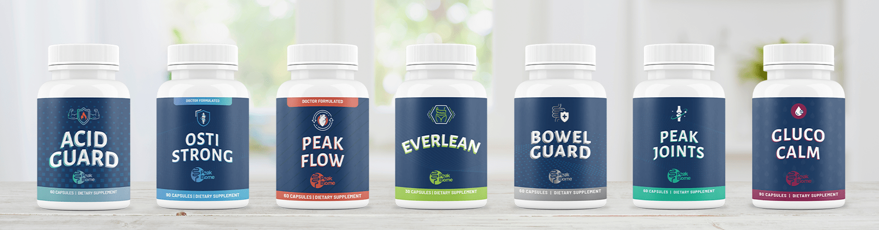
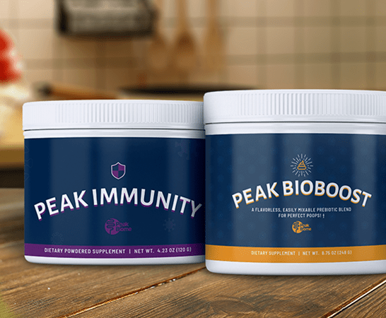
For Peak Biome, we developed a unfied packaging system for a range of health supplements. Each product features its own color highlight and subtle iconography, creating a clear visual distinction between products while maintaining a recognizable identity.


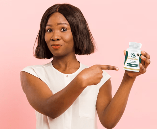
TropiSlim
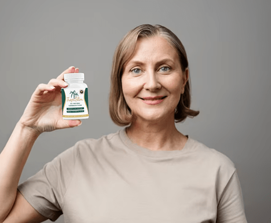
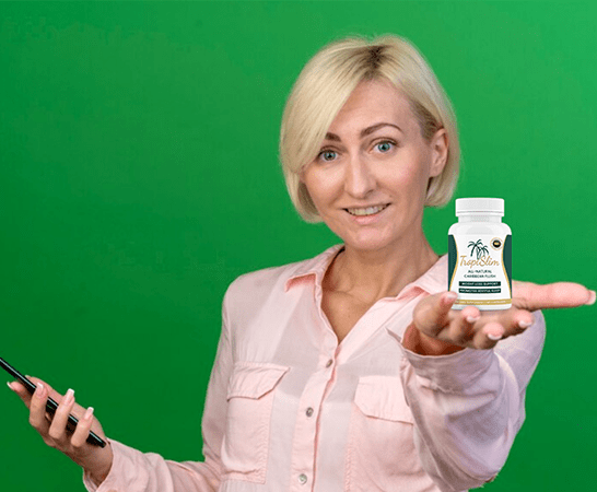
For TropiSlim, we created fresh and playful packaging inspired by a tropical aesthetic. A vibrant green and white color palette, combined with fun visual elements, reflects the product’s energetic positioning and creates an approachable look for a weight management supplement.


Romantic escapade
For Romantic Escapade, we designed sensual packaging that captures the feeling of passion and intimacy. The combination of deep black and rich red tones, along with elegant design choices, creates a bold and sophisticated identity with a strong visual impact.


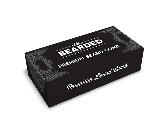
Live bearded
For Live Bearded, we developed minimal packaging that reflects the brand’s masculine character. Clean layouts, strong typography, and refined details create a confident and premium appearance while keeping the focus on the products.


BioLean
For BioLean, we designed modern packaging for a weight loss supplement inspired by the freshness and balance of water. A calming blue color palette, clean design elements, and a contemporary visual approach create a refreshing identity that reflects the product’s focus on health and wellbeing.



BioCleanse
For BioCleanse, we created clean and trustworthy packaging that speaks directly to its target audience. A simple design approach, clear visual hierarchy, and refined details create an approachable and reliable identity that reflects the product’s purpose.



Lean Belly Balance
For Lean Belly Balance, we developed impactful packaging that visually communicates the product’s benefits. A strong design system featuring a flowing wave element represents balance, movement, and a healthy body shape, creating a memorable identity that connects with the product’s purpose.



osteoIQ
For OsteoIQ, we designed a simple and minimal packaging solution for a genetic test kit. A clean layout, carefully selected information, and a refined visual approach create a clear and professional box design that communicates everything users need to know at a glance.